Potbelly
Print Collateral, Signs, Menus
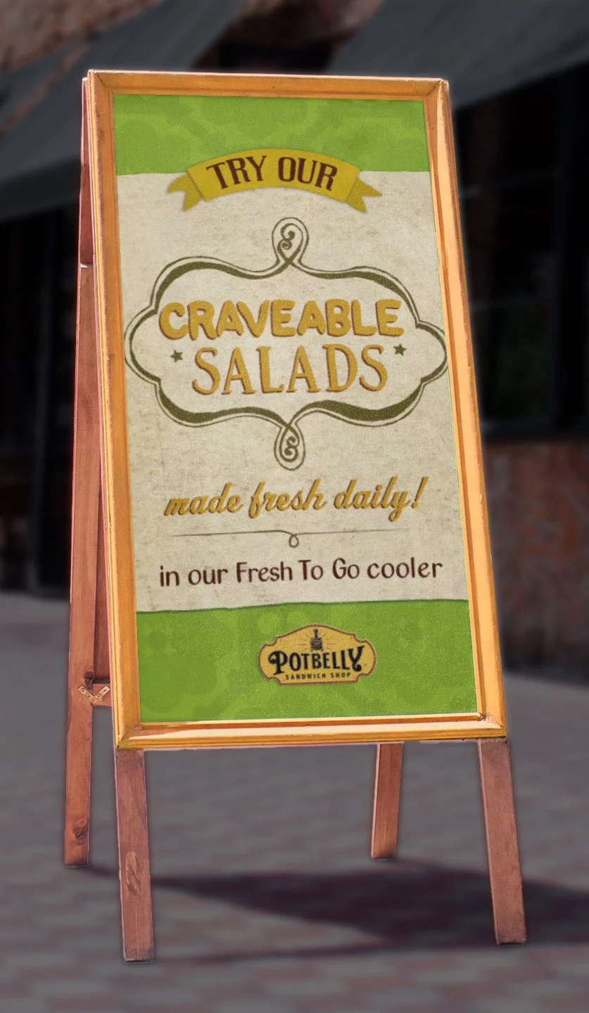
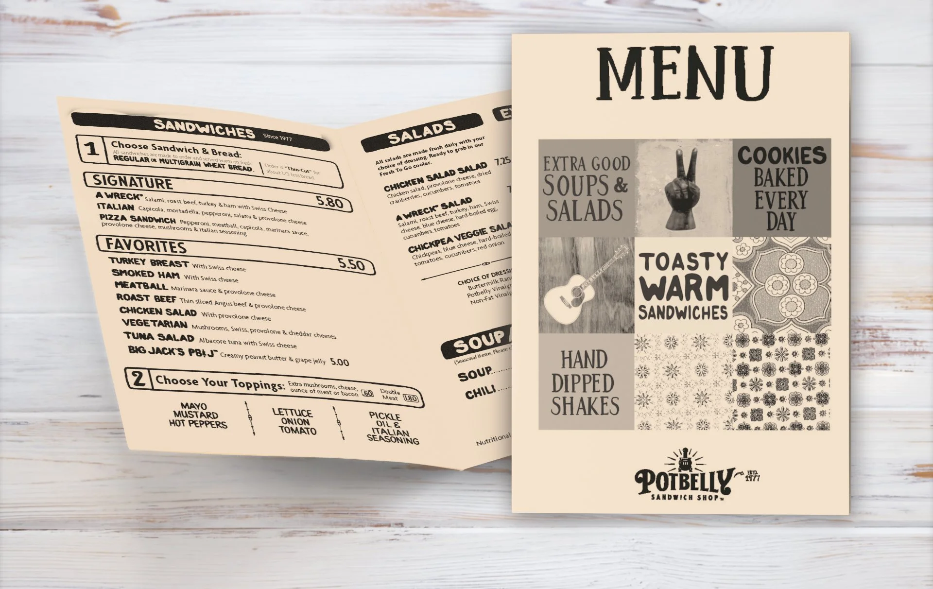
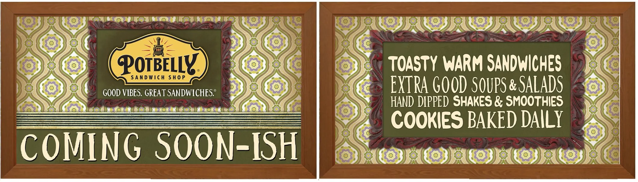
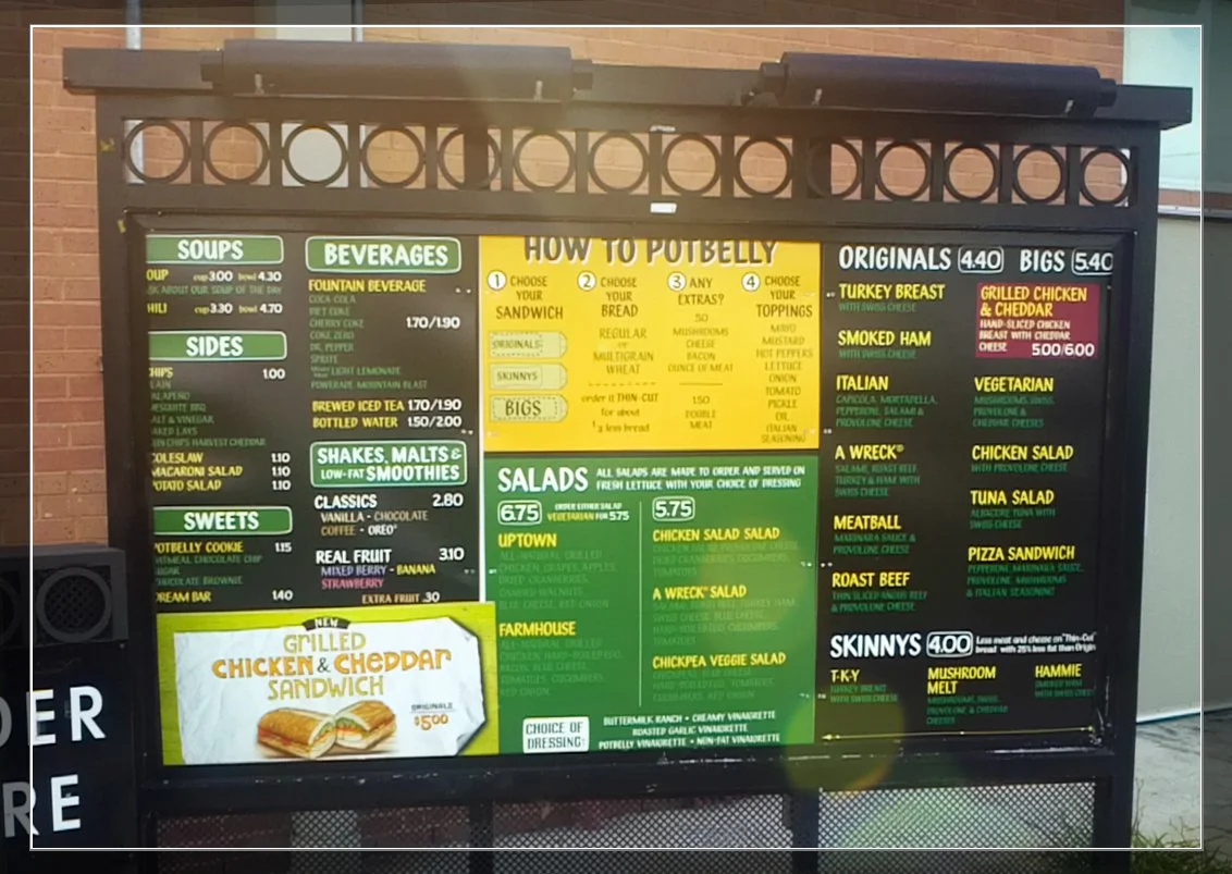
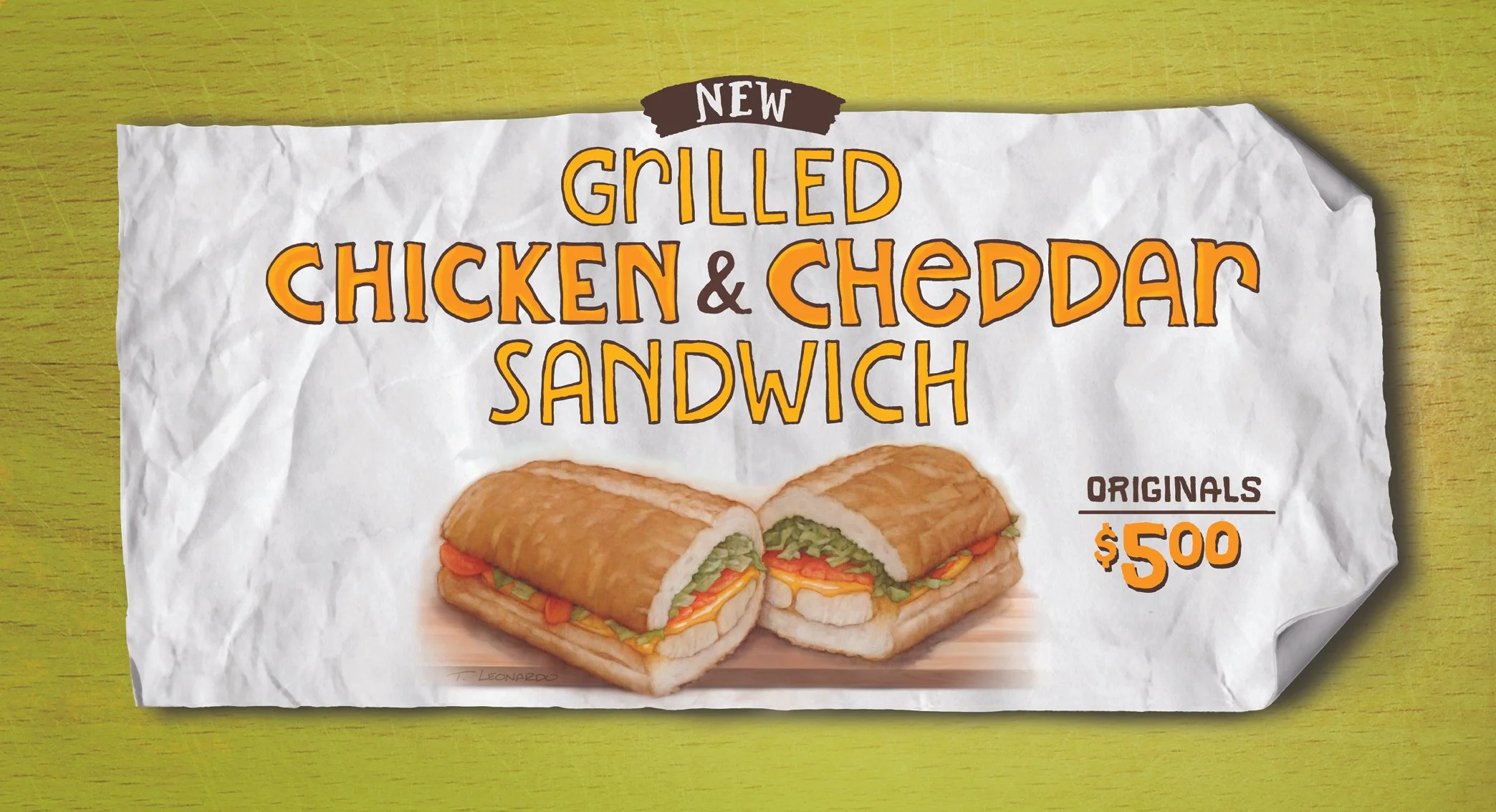
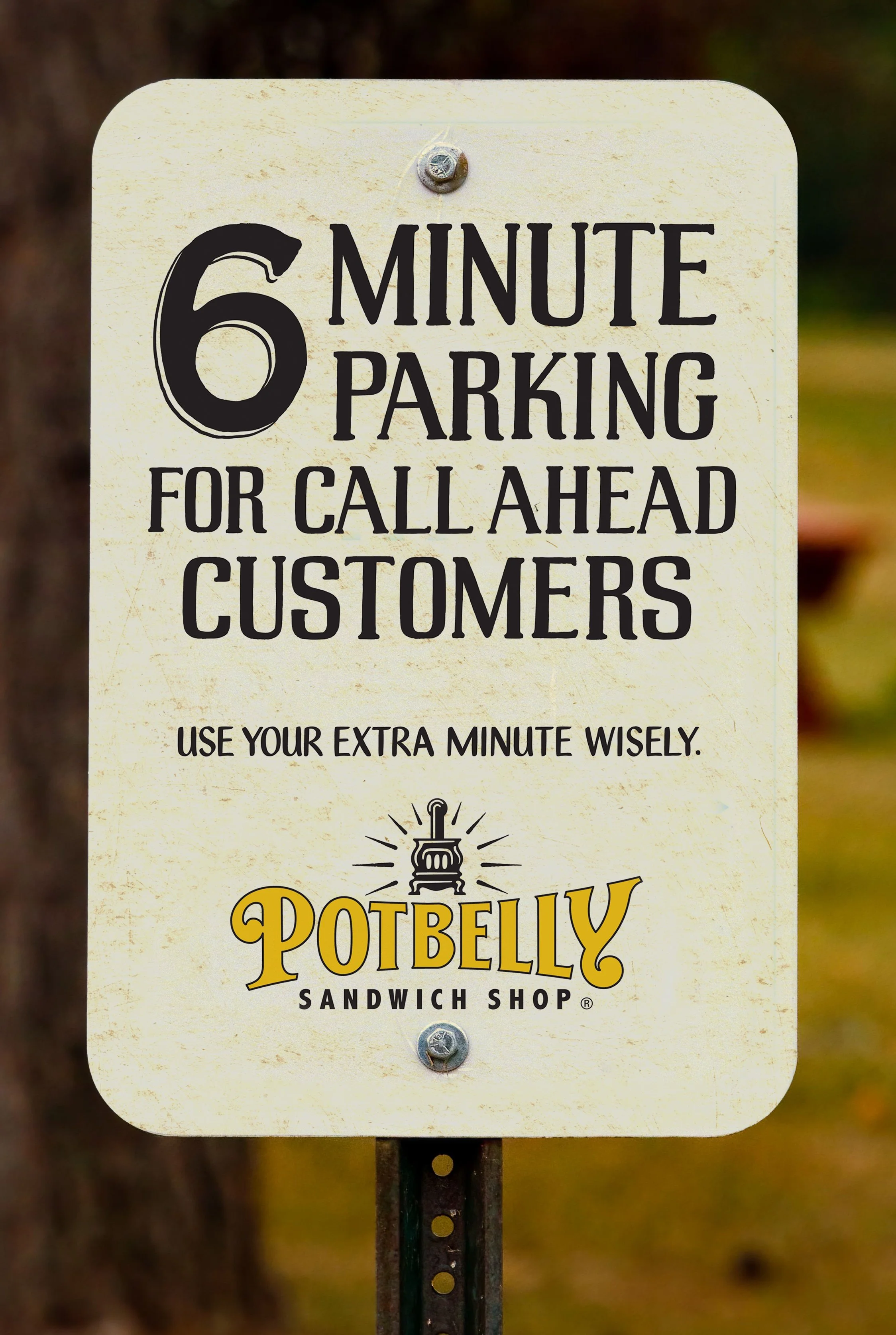
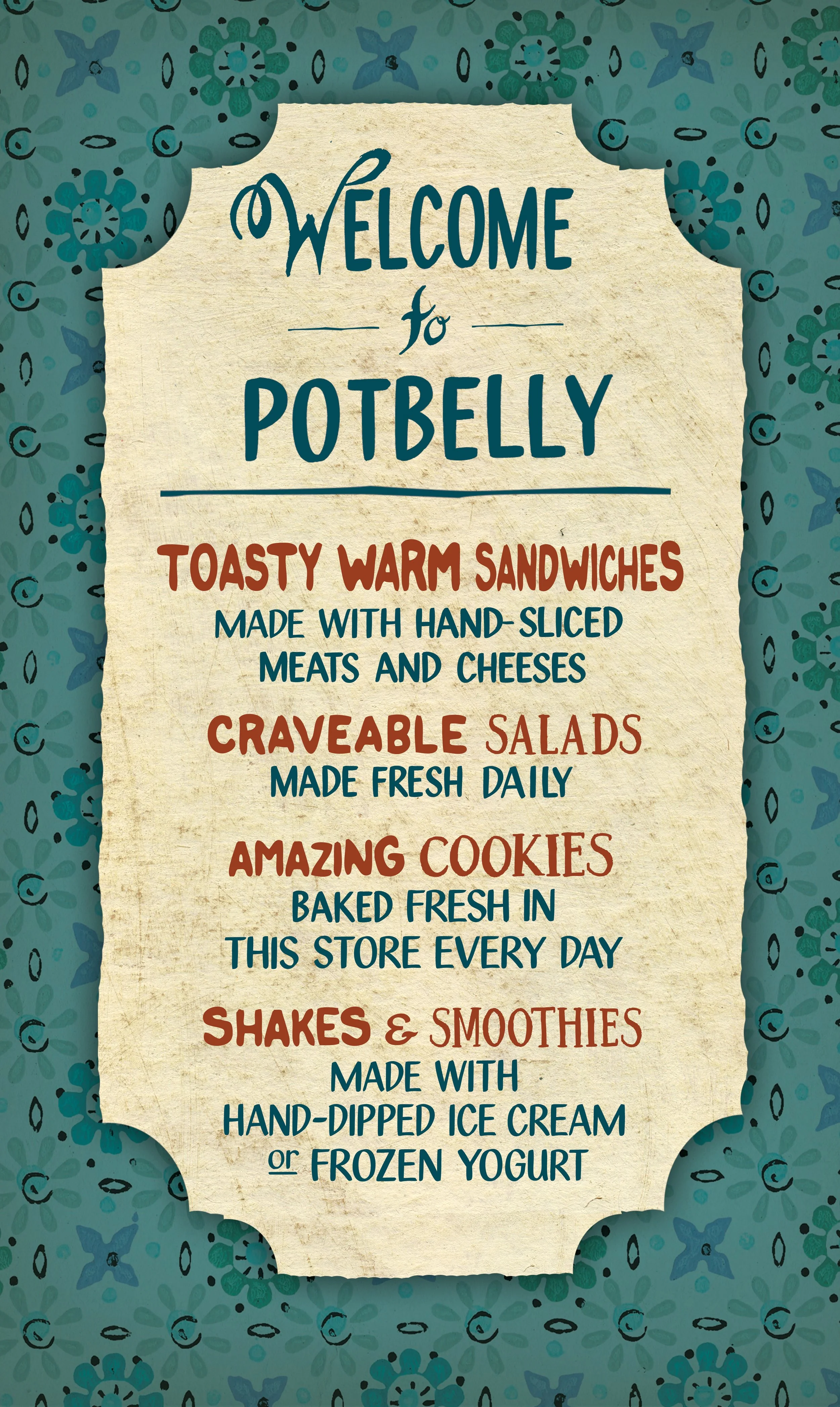
OVERVIEW: At the time that I worked at Potbelly, designers used 3 or 4 hand drawn typefaces to manually lay out each word on their menus and signs. Each letter and punctuation marks was a piece of Illustrator art that had to be hand-placed. Each layer of art was sourced from a proprietary library of patterns and textures. Putting these pieces together was like no other experience I’ve ever had in my career.